Feature prioritisation — impact vs effort
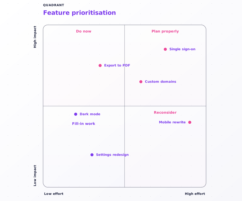
The 2x2 every roadmap argument ends at: features plotted by impact and effort, with each corner naming the decision it implies.
What this diagram shows
"Do now" beats "High impact, low effort" — a quadrant label should say what to do, not restate the coordinates.
If everything clusters in one corner, the axes are wrong. Re-scale so the chart separates the items instead of agreeing with itself.
Past ~12 points the labels crowd and the at-a-glance grouping is lost. Split into one chart per theme rather than cramming.
About quadrant diagrams
Quadrant charts plot items against two axes and split the result into four labelled regions, so the position of each item is already an argument for what to do with it. Use them for impact-vs-effort prioritisation, competitive positioning, and value-vs-risk triage.
This template is written in Mermaid — plain text you can edit, version in git, and regenerate the image from any time.
View Mermaid sourcePlain-text diagram syntax — copy or edit directly.
1quadrantChart2 title Feature prioritisation3 x-axis Low effort --> High effort4 y-axis Low impact --> High impact5 quadrant-1 Plan properly6 quadrant-2 Do now7 quadrant-3 Fill-in work8 quadrant-4 Reconsider9 Single sign-on: [0.75, 0.85]10 Dark mode: [0.2, 0.45]11 Mobile rewrite: [0.9, 0.4]12 Export to PDF: [0.35, 0.75]13 Settings redesign: [0.3, 0.2]14 Custom domains: [0.6, 0.65]Related templates
More templates that cover similar workflows.